Many people struggle to understand the value of investing in their analytics. You can use Google Analytics to measure your traffic, eCommerce, adwords without much effort. It’s actually pretty good.
However, with just a little work, you can get so much more value!
We use these sources of data to advance your analytics, but by integrating the data sources and presenting it in ways not possible in GA.
Kraken Data have developed a solution utilising Google Data Studio as a reporting and visualisation interface that can give you a more detailed, integrated view of your key metrics by segment and against historical performance.
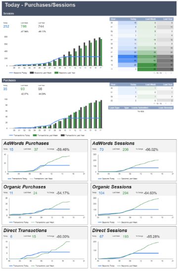
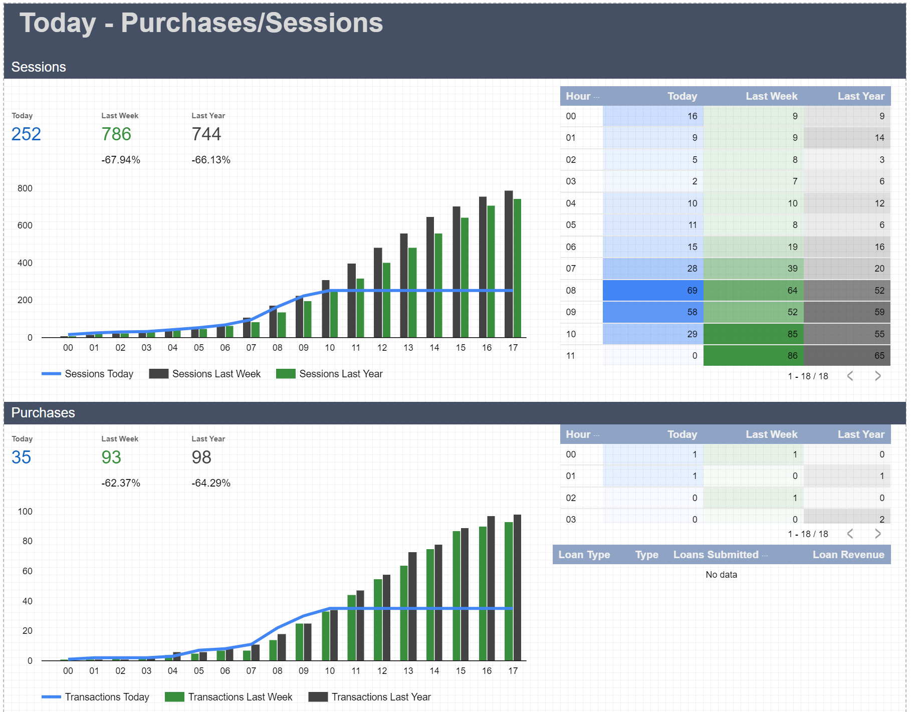
For example, how does your website perform during business hours compared to non-business hours. How are you performing today by hour, compared to the same day last week, same hour last week, or even the same hour 20 weeks ago! You can’t do this in Google Analytics, the UI simply doesn’t allow for these types of comparisons.
This stuff is important because businesses typically have a pattern of performance over the week, month, quarter and year. Comparing Friday with Thursday or Monday with Sunday, isn’t great. We really prefer to look at this Monday compared to other Mondays.

Wouldn’t you like to be able to look at how many products you’ve sold today, by hour and compare that to the same day last week?

Kraken Data have developed a solution that allows us to efficiently develop in-depth visual dashboards that integrate Google data outside the capabilities of Google Analytics. This gives you much more insight into the performance of your website and channels. And best of all, this is all available in a dashboard, removing the need for analysis to discover the trends. This saves the analysis for discovering the sources of the successes or issues.
This is just a snippet of what the full Data Studio set of dashboards can do. If you’d like to chat about having your data visualised in these ways, please get in touch.