We have all been using conditional formatting in our reports created in Excel and Google Sheets for a long time, but it has not been available in Google Data Studio – until now!
Sure it is still early stages, but you can already use it to highlight data of interest to add even more visual impact to your reporting dashboards.
In this brief intro I will demonstrate a simple example of conditional formatting and also demonstrate how to apply multiple conditions to the same row. This will also highlight the importance of the order of the conditions you apply.
Getting Started
Firstly you need to decide on the data you want to apply the conditional formatting to.
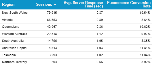
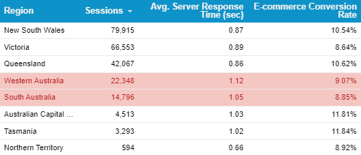
For this example we have a Google Analytics table that looks at server speed and adds sessions and e-commerce conversion rate data in.
Adding the First Condition
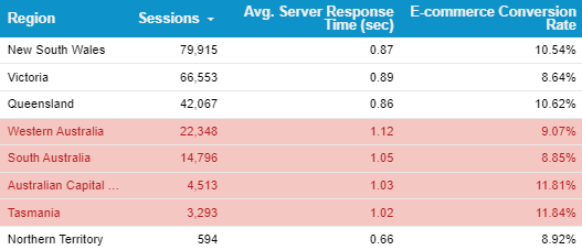
For this example we are going to indicate which of the regions is experiencing the slowest server response time, we’ll set the trigger to be anything above 1 second.
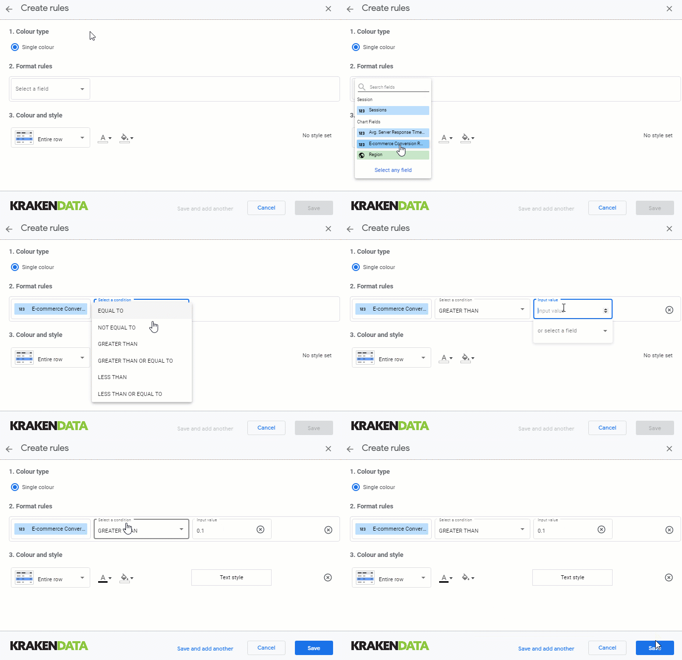
We select the required field, choose the “greater than" condition and then add the 1 second trigger. Then we choose how we want the display to be altered, here we choose red text with a pale red background and hit save. We have also chosen to highlight the whole row rather than a single field.

The Resulting Table
The table displays the impacted rows as designed in the previous step. This is a small table, but for larger tables you might want to add some extra formatting.
In this case we are going to say that we don’t want to highlight rows that performed well for e-commerce conversion rate. We’ll assume the speed is not as important here (this is just to demonstrate the use of multiple filters!).
The Second Formatting Condition
As before, we set the condition but in this case we set the text colour and background to match our default scheme. We are using 10% as the trigger, in the conditional formatting value it is written as 0.1
Hitting save will apply this second options after the previously created one.
The Order of Conditional Formatting
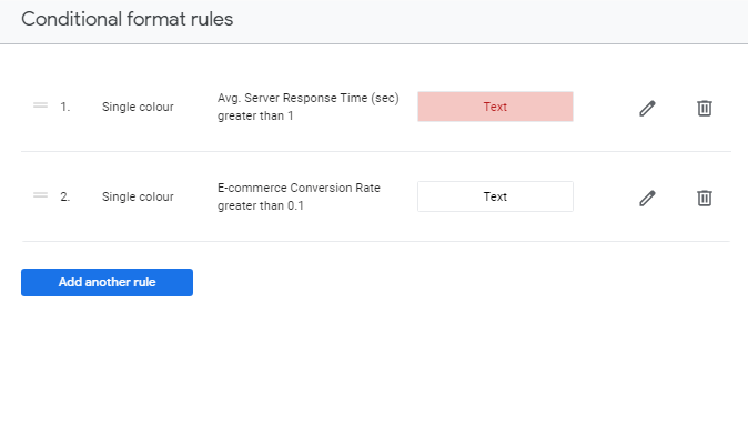
It is very important that this second filter is the last in the order as the formatting is overwritten for each subsequent condition. If we placed this second condition at the start, it would be overwritten and have no effect.
As long as you keep this in mind you can build tables that visualise the data with more insights than ever.
The Finished Table
With the second conditional formatting option applied we see that fewer rows are selected in red, focusing us on the most interesting areas for concern.
I’m sure that Google will continue to build on this functionality so it starts to match that available within Excel and Google Sheets.
Please contact us to talk about your own website/online business and how KRAKENDATA can help you with your data visualisations, we love chatting about analytics and optimisation!