The KRAKEN DATA team are always looking at a variety of websites and we have decided to put together the first of a series of posts.
In these we will talk through a quick list of ten CRO test ideas that we saw in 10 minutes. It is amazing how quickly an external view of your website can throw up ideas for improvement and testing!
First up, an American icon – Macy’s. We’ve all seen it in the Thanksgiving Parade in movies like Miracle on 34th Street, but how does its online presence hold up?
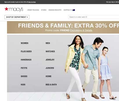
At first glance it looks like a site that needs a total revamp, but instead of a complete redesign – why not test elements to see what actually works best for the visitor (and your conversion rate!)? Site evolution allows for data driven change, you should also read a previous post, Site redesign as a continuous process.
1. The Popup
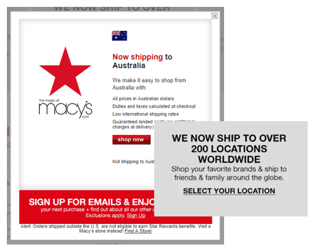
Popups can be great, here we see it uses geo-location to highlight that Macy’s ships to Australia. When you close the popup and scroll down, you see it actually ships to over 200 locations. This serves to underline how mature the Macy’s shipping program is, so surely it would be better to say something like “Now shipping to Australia and to over 200 countries"?
There is no doubt that there is a need to test the content here. One thing that doesn’t need testing is ensuring you only display the popup once! At the moment it appears for EVERY visit to the homepage.
2. Newsletter Signup
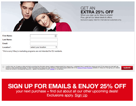
Also included in the popup is a “Sign up for emails" call to action that takes you to a signup page. Why not remove this extra step and just have the form embedded into the popup?
Does this lead to a lift in newsletter enrolments? We can’t be certain, but an A/B test would prove the benefits conclusively (and we never like to guess).
3. Home Page
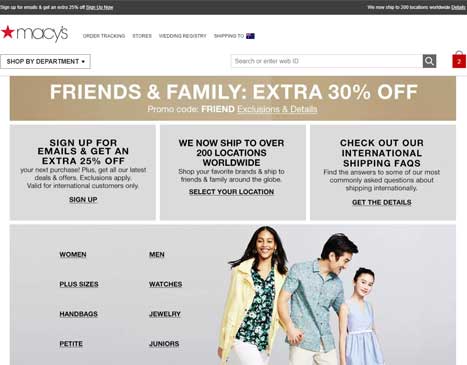
Great! You have some USPs and specials – but why are they hidden below the fold? We would definitely test the placement, content and design of these elements. Which ones lift visitor engagement and eventual conversion?
We would look at multiple conversion points for success, newsletter signups, AOV, order conversion rate etc. Finding the right balance to get the best result for both the visitor and Macy’s would be achieved with a few well designed tests.
4. The Promo
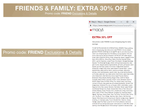
Looks like a great promotion, extra 30% off – but why is the call to action talking about exclusions? Surely talking about finding out more about this great offer is a more positive approach? Worse still is the popup! It is unreadable and causes anxiety in the buyer due to its small text and verbose content.
We spend a lot of time looking at tone and language when we put together our tests, simply changing the order of the questions in a form can yield significant lifts.
5. Shopping Bag
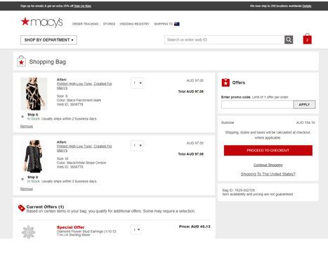
The shopping bag has no USPs or safe shopping messaging. Definitely worth checking out the placement and content for both of these.
There is also a problem with the weighting given to the individual elements on the page. Apart from the main CTA, everything seems to blend together making it difficult to read. Using font size and whitespce to highlight important content is a common testing area – picking out the elements that are positive to the buying experience.
6. The Promo Code
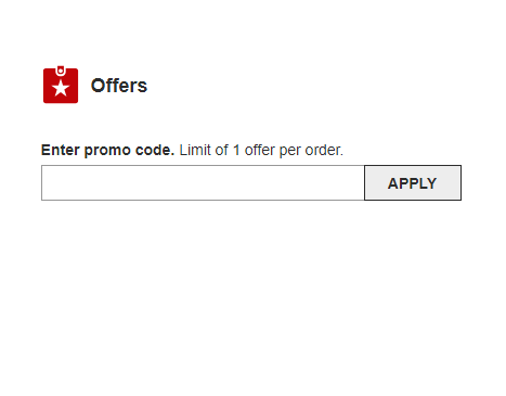
Currently the promo code is very visible, we would test making this as a text link only, it can tend to make visitors go off looking for coupon codes.
Displaying the form field after a click from the visitor could reduce the possible leakage from this element.
7. Use of colour
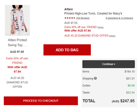
Red, red, red. I know it may be the corporate colouring – but it looks like a warning for both the main CTA and the item cost.
This is compounded when you get a change of colouring on the checkout page. Consistent use of colour and tone is essential for a positive visitor experience. We have seen colour have a strong effect on conversion rates, again testing will prove this one way or the other.
8. Unnecessary Content?
Some of the best tests you can run involve removing content. Does it add value? Is it serving a purpose?
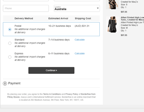
The checkout page has a section below the Continue button, removing this and changing the CTA text would be a great test. It is always worth questioning all the content on the page, particularly in the checkout process.
9. More distraction
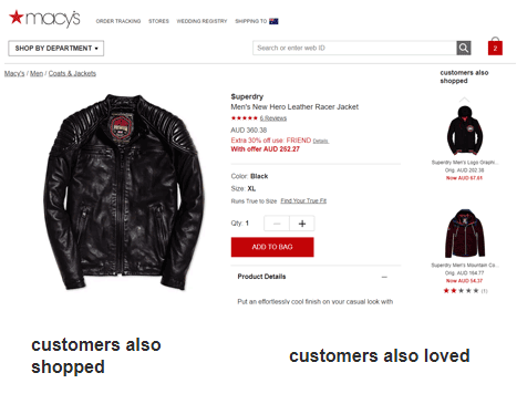
The product pages have a section to the right that distracts from the visitors chosen item. Removing this, or positioning it below gives the product pricing etc. much more space.
I’m also a little confused about the difference between “customers also shopped" and “customers also loved" ?? Difficult to justify having both competing elements.
10. Search
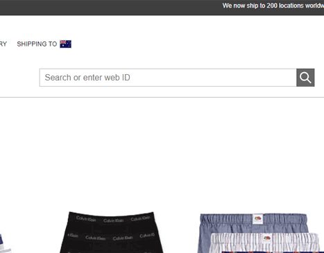
Increasing customer engagement generally leads to a lift in conversion rates (generally but not always – hence the testing!). The search box could be given even more prominence on the page, we have seen more searches = more sales in the majority of tests.
Again here the terminology is weird, what is a web ID?? Sounds like an internal use function. Test the messaging that produces greater engagement.
If you would like to talk about your own website/online business and how KRAKENDATA can help you lift conversions please contact us, we love chatting about analytics and optimisation!