The use of urgency and scarcity messaging (Ending Soon!, Stock Low! etc.) has been a standard staple of online business since the early days.
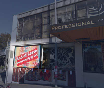
In fact it has been a standard practise used in bricks and mortar retail forever. There was a famous store in Sydney (I remember the same in Melbourne many years ago) that always displayed “End of Lease – Everything MUST Go!!”. This went on for years, but apparently it has finally closed!
The data available to online businesses allows them to create dynamic, tailored messaging that is used to influence visitor buying behaviours using a variety of techniques.
The rise in FOMO (Fear of Missing Out), particularly in millennials, has led to more and more instances of urgency messaging. A study by Eventbrite showed that 69% of millennials experience FOMO when unable to attend an event that theirs friends and family are attending.
Here are a few examples that demonstrate the variety of business sectors using urgency and scarcity messaging and the methods they employ.
Qantas
Qantas has had a recent redesign of their domestic booking funnel.
The Urgency
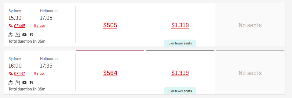
With this has come a change in their use of scarcity messaging, some visual and some technical. When entering the search results page you get a subtle indication for two elements:
- Fare types no longer available – indication the popularity of certain fare and route types
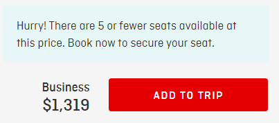
- “5 or fewer seats available” – get in quick
As you expand the flight details you are left in no doubt that seats are limited and you should book now.
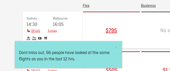
In case you needed one final reminder, you get a “”Kogan” style reminder popping up about how popular that flight has been in the last 12 hours.
Village Cinemas/Hoyts
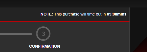
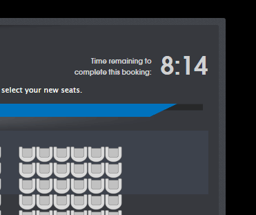
Both Village Cinemas and Hoyts use a similar countdown technique.
The Urgency
They use a countdown to generate a sense of urgency to complete the booking, otherwise the procedure restarts. A couple of things interest me here:
- If the countdown gets down to say 30 seconds and you are just entering the payment screen, is that just causing major anxiety in the visitor? Could you add the ability to extend the booking period?
- Neither site makes the choosing of seats a necessity. If you made the visitor choose a seat, would that give them a sense of ownership and make them more likely to complete purchase?
Zappos
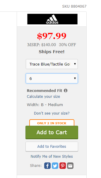
Zappos is an online shoes and clothing store.
The Urgency
It has refined its scarcity and urgency messaging down to showing real-time stock levels for low stocked items. This really ramps up the authenticity level of the messaging, maybe the next step would be real-time updates where the number counts down as someone else buys the item?
The Warehouse
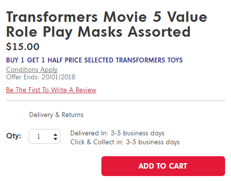
The Warehouse is one of New Zealand’s largest online retailers and has also been through a recent revamp.
The Urgency
This has led to a cleaner, more elegant design. In this example it has time based urgency messaging – I wonder if it may actually be too subtle? It makes the visitor have to work out how long is left on the special, maybe a countdown timer might make this more obvious and lift the sense of urgency?
catch.com.au
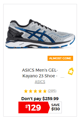
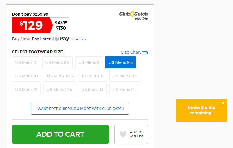
Catch.com.au is a daily deals company.
The Urgency
It specialises in limited offers and again has spent a lot of time on urgency messaging. They use colour as well as copy to highlight availability.
amazon
amazon is constantly testing its buying processes.
The Urgency
As is the case with most conversations regarding innovation and conversion rate optimisation on the web, the behemoth that is Amazon demands recognition for the various ways it uses urgency messaging for it’s many sellers. This example is time based, but uses delivery as the trigger for the urgency message. Want this tomorrow? Then buy it in the next hour!

When it comes to you using scarcity or urgency on your website it is important you test the impact. Just because something works on Amazon doesn’t mean it will work with your products/customers. You could actually end up scaring customers by creating anxiety.
For urgency tests there are some basic elements that provide good starting points:
- Set a deadline for the promotion
- Use colours that accentuate the urgency (reds and oranges rather than greens and blues)
- Have copy that resonates with the urgency. Hurry, now etc. add to that feeling of urgency
Similarly for scarcity some basics help:
- Low stock numbers
- Low seat/room availability
Kraken Data has helped companies design, test and implement urgency messaging across a large number of industries from online retail through to health insurance and travel. Contact us now to find out how we can help you maximise your conversion rates.